Unveiling the Colors of Naruto Manga: A Visual Analysis of Volume Covers
The world of manga is a vibrant realm of imagination, where fantastical storylines and unforgettable characters come to life through the power of illustration. Among the many manga series that have captivated readers worldwide, Naruto stands out as a global phenomenon, with its captivating tale of a young ninja's journey to become Hokage, the leader of his village.
My project was inspired by several remarkable endeavors that have explored the power of color in various forms of visual expression. Among these, the 50 Years of 'Avengers' Comic Book Covers Through Color by the Wall Street Journal, Front Page Fingerprint by Derek Chan, The Colors of National Geographic by Jared Wilber, Color Palettes of The New Yorker by Nicholas Rougeux, and "Ten Artists: Ten Years" by Arthur Buxton stand out as particularly inspiring examples of data visualization and storytelling through color.
Inspired by these fascinating projects that have explored the color palettes of iconic magazine covers and comic book illustrations, I embarked on a journey to delve into the visual language of Naruto manga. My goal was to uncover the stories woven into its 72 volume covers through the lens of color, revealing the trends and themes that have shaped its visual narrative over time.
The Data
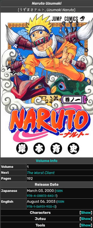
The data for this project was collected from the Narutopedia wiki. Its List of Volumes page contains with the list of all volumes and the links to their dedicated pages. Each dedicated page contains the cover image and other information about the volume.
I used Python's beautifulsoup and requests to scrape the volume number, name, release date, and the url of the cover image from the webpage of each cover.
Methodology
To analyze the color clusters of the covers, I first extracted the RGB components of each of the pixels in a cover. I then converted the RGB values to the CIELAB color space, which is designed to approximate human vision. I used the scikit-learn library to perform K-means clustering on the CIELAB values, which grouped the pixels into clusters based on their color. The K-means algorithm requires the number of clusters to be specified, so I used the Elbow method to determine the optimal number of clusters for each cover.
For each cluster in each cover, I reported the following information:
- The number of pixels assigned to the cluster,
- The percentage of pixels in the cover belonging to that cluster,
- RGB, L*a*b*, HSV, and hex values of the cluster's centroid,
- The following information of the closest (in Euclidean distance) named color from the Large List of Named Colors by Martin Krzywinski
- index in the Large List of Named Colors, and
- name of the color,
- hex value,
- distance from the cluster's centroid, and
- The following information of the colors in the Large List of Named Colors that are within a distance of 5 from the cluster's centroid, if any
- index of the color in the Large List of Named Colors,
- name of the color,
The code is available here, and you may explore the compiled data using the API endpoints below:
- /api/naruto-volumes - List of all volumes and their color cluster, and
- /api/naruto-volumes?volume=:number: - Color clusters of a specific volume. Replace
:number:with the volume number. Valid values are 1 to 72.
The Analysis
Naruto was published in two parts: Part I (2000-2005) and Part II (2005-2014). The two parts are separated by a two-and-a-half year time skip, and the storylines are quite different.
Part I
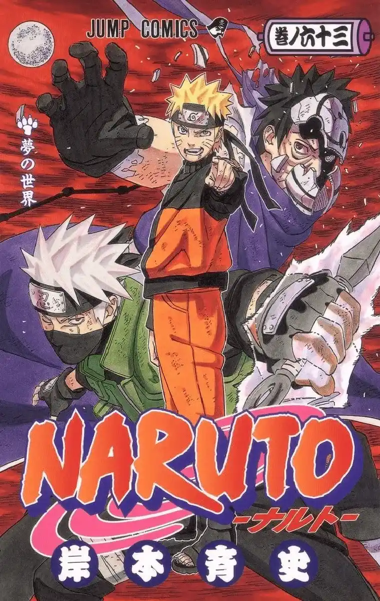
In the covers of Part I, we witness the exuberance and youthful energy of Naruto's early years. Below, we see the first two covers of the series, which set the tone for the rest of Part I. Along with the covers, I have included a bar consisting of the colors in the cover, with the length of each color segment corresponding to the percentage of pixels in the cover that belong to that color cluster.
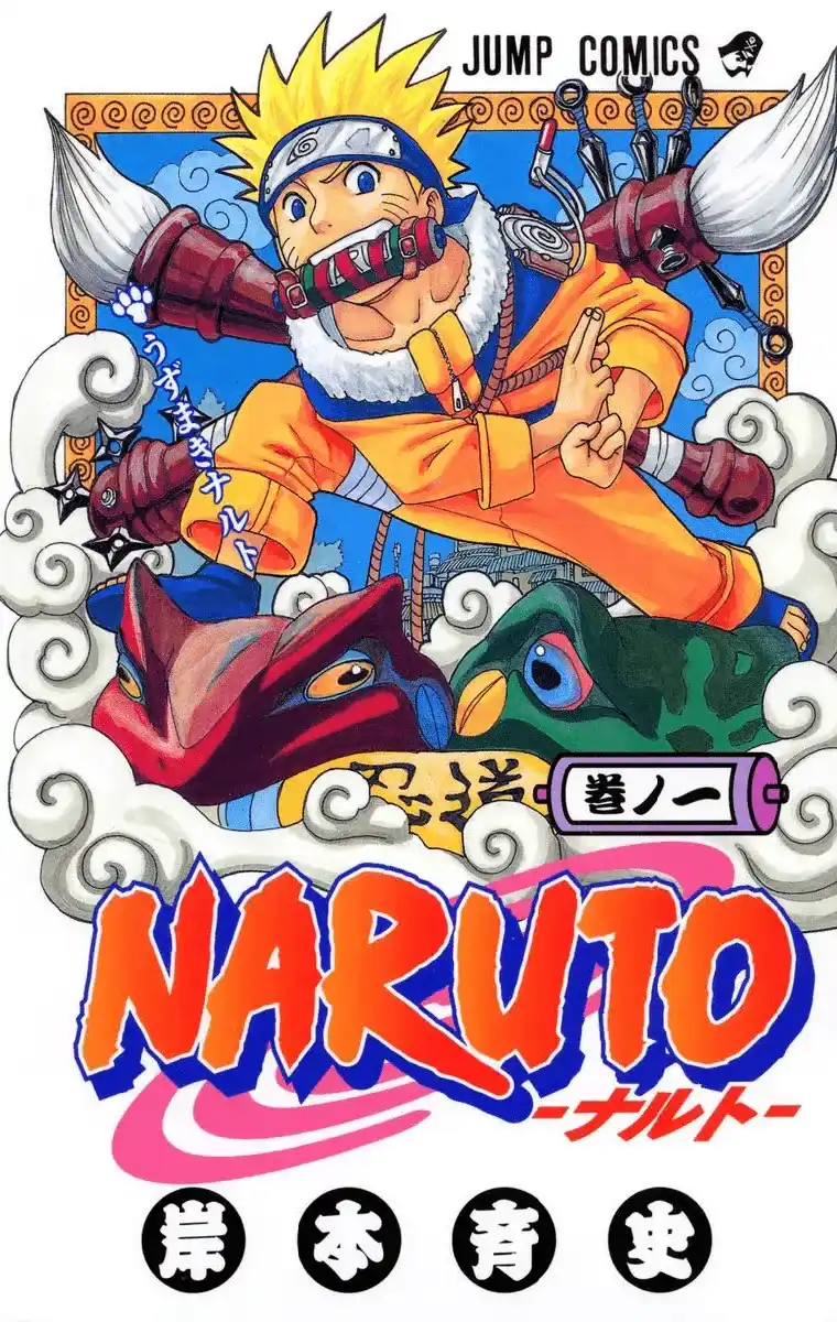
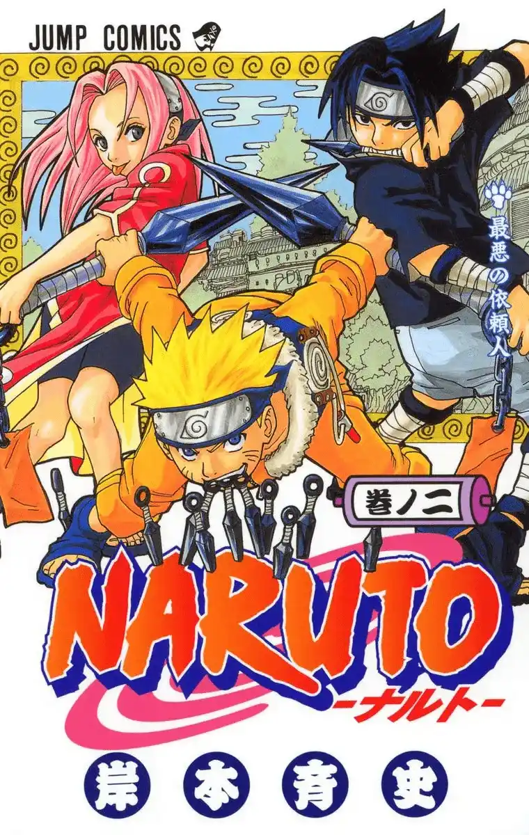
The predominant colors lean towards warm tones, with a focus on oranges and yellows, mirroring Naruto's fiery spirit and determination. The covers often depict Team 7, consisting of Naruto, Sasuke, Sakura, and their sensei Kakashi, set against white backdrops. These visuals encapsulate the sense of camaraderie, growth, and the adventurous spirit that defines the initial phase of Naruto's journey. Below, I have included a timeline of the covers from Part I, with each cover's dominant color clusters represented by a bar as before.
Part II
The transition to Part II brings about a noticeable shift in both the narrative and the visual language of the covers. The color palette deepens, embracing darker tones and more complex compositions. Shades of blue, black, and red become prominent, signaling a maturation of the storyline and a departure from the carefree days of Part I.
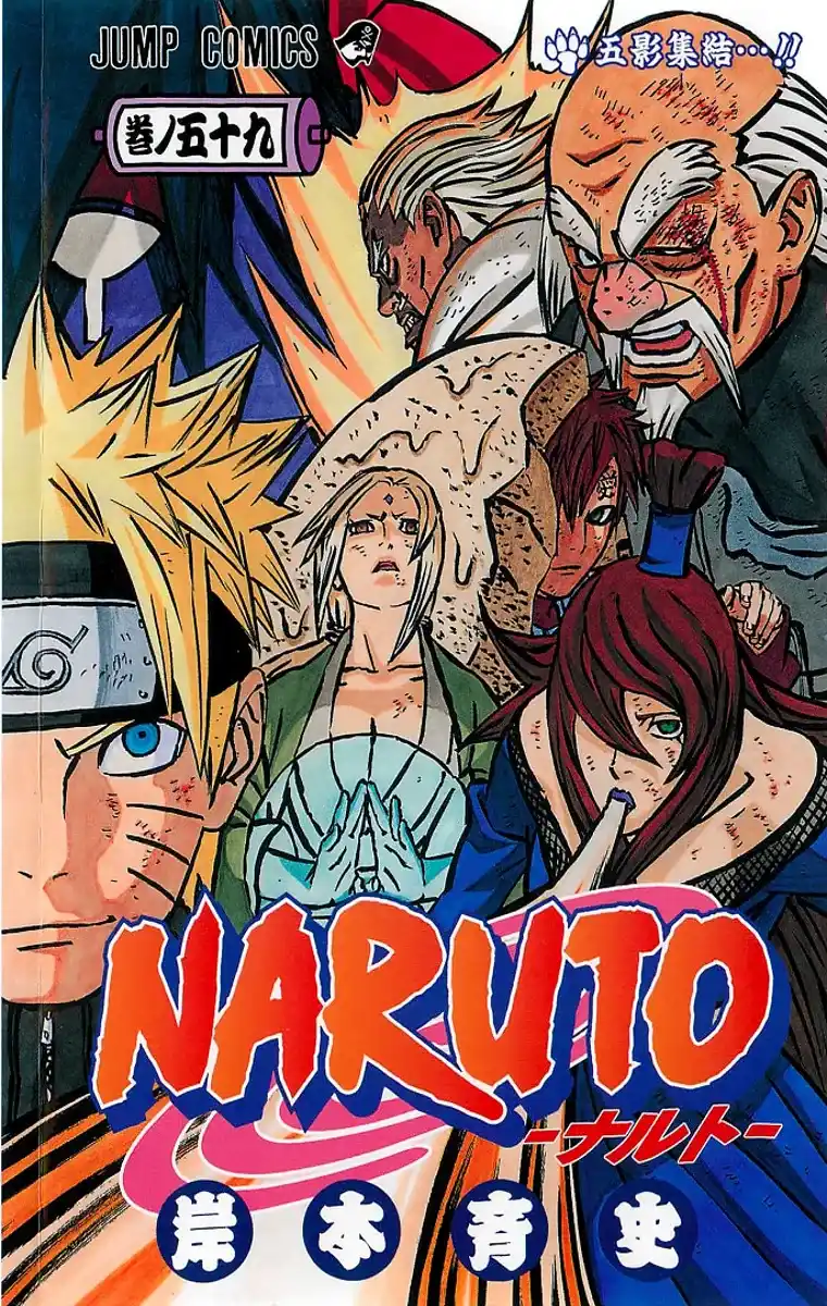
As the characters age and face more profound challenges, the covers reflect a sense of intensity and seriousness. The imagery often includes iconic symbols of the Akatsuki, the enigmatic organization that becomes a central focus in Naruto Shippuden. The backgrounds become more ominous, with stormy skies and scenes of conflict, alluding to the heightened stakes and the looming threats that the characters must confront.
Symbolism in Color: From Innocence to Peril
The evolution in color themes across the Naruto manga covers is not merely an aesthetic choice; it serves as a visual representation of Naruto's transformative journey. The warm and bright hues of Part I symbolize the innocence and optimism of youth, while the darker and more intense tones of Part II mirror the challenges, complexities, and darker undertones of Naruto's Shippuden adventures.
As we explore the covers in detail, the subtle yet impactful changes in color choices become a narrative in themselves, inviting readers to delve deeper into the thematic layers of Naruto's epic tale. Join me as we embark on a visual journey through the kaleidoscope of colors that encapsulate the essence of Naruto's evolution from a spirited ninja apprentice to a formidable force in the ninja world.
Visualizing Naruto's Colors: A Unique Journey Inspired by "Writing without Words"
As I delved into the exploration of Naruto's color palettes, I drew inspiration from Stefanie Posavec's intriguing work, "Writing without Words." In this project, Posavec visually represented text data by creating intricate and artistic visualizations using continuous lines. Intrigued by this concept, I decided to apply a similar approach to the colors of Naruto manga covers, turning each cover's dominant color clusters into a unique and visually compelling journey.
For each Naruto manga cover, I translated the color data into a continuous line, making a left turn after each color segment. The length of each segment corresponded to the frequency of that color on the cover. The result was a captivating visual representation that encapsulated the essence of the cover in a single, fluid line.
Left Turns: A Structured Exploration
The first visualization took a left turn after each color, creating a structured and ordered exploration of the cover's color palette. This approach provided a sense of continuity, allowing viewers to follow the narrative of colors from start to finish. The line gracefully meandered through the spectrum, revealing the predominant colors and their distribution on the cover.
The drawing started at the green dot and ended at the red dot.
Random Turns: Unpredictable Expressions
In a departure from the structured left turns, the second visualization introduced an element of randomness. Instead of always turning left, the line took random turns after each color segment. This approach injected an element of unpredictability, resulting in a more dynamic and abstract representation. The line danced across the canvas, reflecting the diverse and sometimes unexpected color choices found in the Naruto manga covers.
The drawing again started at the green dot and ended at the red dot.
These unique visualizations offer a fresh perspective on Naruto's color palettes. The structured left turns provide a methodical exploration, akin to reading a story, while the random turns add an element of surprise, mirroring the unpredictability of Naruto's adventures.
Disclaimer
This analysis and visual exploration of Naruto manga covers, including the utilization of copyrighted material such as images and color data, were conducted strictly for educational and analytical purposes. The intent is to provide a transformative and insightful examination of the visual elements within the context of the Naruto series.
The usage of copyrighted material complies with the principles of "fair use" under copyright law. This analysis is non-commercial, and the inclusion of copyrighted content is for the purpose of commentary, criticism, and educational understanding. The transformative nature of this project adds value to the original work, utilizing the material in a manner that goes beyond mere reproduction.
All copyrighted material, including images and color data from Naruto manga covers, belongs to its respective creators and publishers. The analysis and visualizations presented here do not seek to infringe upon the rights of the original creators but rather aim to contribute to the broader conversation and appreciation of the artistic and storytelling aspects of the Naruto series.
If you are a copyright holder and have concerns about the usage of specific material, please contact me for resolution.